Posts Tagged ‘color of the year’


Benjamin Moore’s 2020 Color of the Year


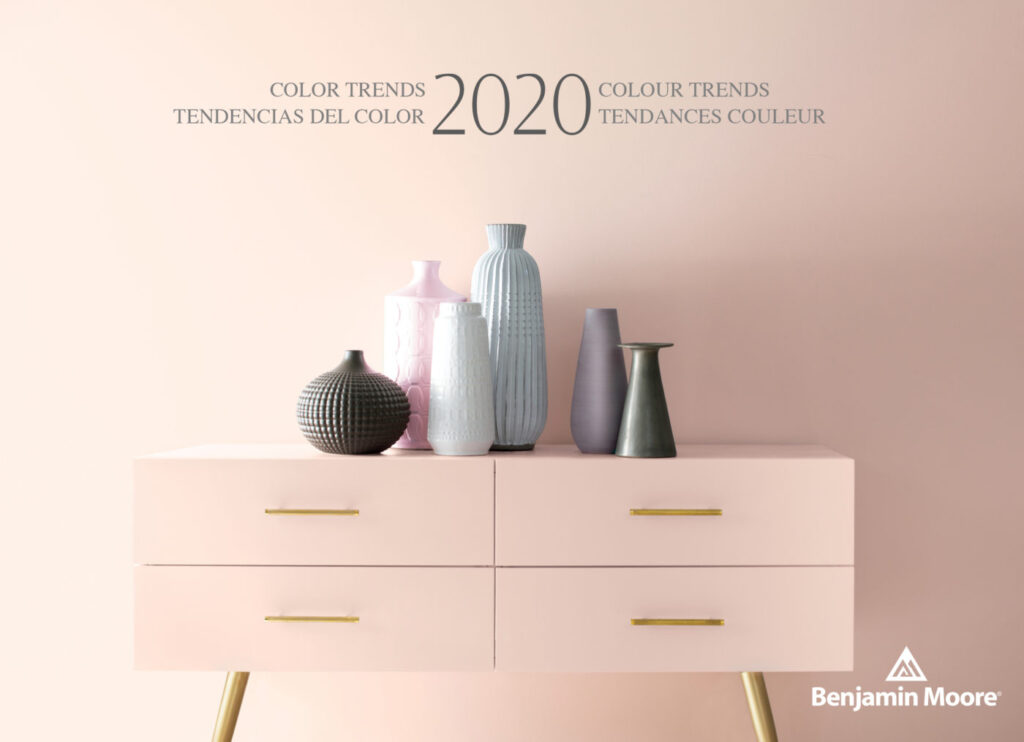
Benjamin Moore & Co. has recently revealed its Color of the Year 2020, a warm, blushy pink named First Light. It’s the company’s first time choosing a pink hue for Color of the Year, bringing the optimistic vibe that people are craving in their lives today as well as a feeling of comfort.


“It’s going to be the new decade, and we knew this was a big moment for us to do something interesting,” says Hannah Yeo, Color & Design Manager at Benjamin Moore & Co. “Today’s changing technology, environmental concerns, and cultural and economic influences are all shaping how we live. More than ever, we expect the home to provide security, comfort, community, self-expression, and optimism. So we said, what are some of the colors that would really help with that?”

With that mindset, the company was able to arrive at First Light as well as its Color Trends 2020 Palette, which consists of a selection of pastels including jade-green Crystalline AF-485; sky-blue Windmill Wings 2067-60; and sunny Golden Straw 2152-50, among others. The trend toward expressive, saturated colors signifies a departure from the more subdued Color of the Year 2019.


“Now, let’s use color to express ourselves, be a little more upbeat, and happy,” she concludes. “We all need that optimism in our lives.”


We invite you to take a look at the wonderful collection of colors that Benjamin Moore has to offer as well as scheduling an appointment with our Color Consultant to help you find the color that best fits your lifestyle.


Palette Pro. Beautifully done.

Sherwin Williams Color Of The Year 2018

Sherwin-Williams reveals it’s 2018 color of the year and it’s ‘the color of wanderlust.

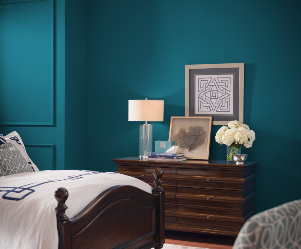
The paint company revealed that “Oceanside” will be their Color of the Year. Inspired by travel, the blue-green hue will add an air of mystery and elegance to any space.

“People today have a growing sense of adventure, and it is making its way into even the coziest corners of our homes. We are craving things that remind us of bright folklore, like mermaids and expeditions across continents,” said Sue Wadden, director of color marketing. “Oceanside is the color of wanderlust right in our own homes.”


Let us know if it’s time for a interior painting change.

Palette Pro. Beautifully done.