Archive for the ‘Tips’ Category


Benjamin Moore’s 2020 Color of the Year


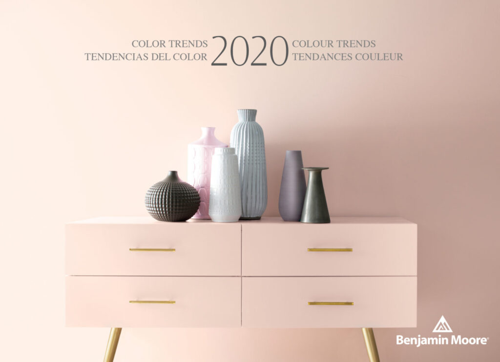
Benjamin Moore & Co. has recently revealed its Color of the Year 2020, a warm, blushy pink named First Light. It’s the company’s first time choosing a pink hue for Color of the Year, bringing the optimistic vibe that people are craving in their lives today as well as a feeling of comfort.


“It’s going to be the new decade, and we knew this was a big moment for us to do something interesting,” says Hannah Yeo, Color & Design Manager at Benjamin Moore & Co. “Today’s changing technology, environmental concerns, and cultural and economic influences are all shaping how we live. More than ever, we expect the home to provide security, comfort, community, self-expression, and optimism. So we said, what are some of the colors that would really help with that?”

With that mindset, the company was able to arrive at First Light as well as its Color Trends 2020 Palette, which consists of a selection of pastels including jade-green Crystalline AF-485; sky-blue Windmill Wings 2067-60; and sunny Golden Straw 2152-50, among others. The trend toward expressive, saturated colors signifies a departure from the more subdued Color of the Year 2019.


“Now, let’s use color to express ourselves, be a little more upbeat, and happy,” she concludes. “We all need that optimism in our lives.”


We invite you to take a look at the wonderful collection of colors that Benjamin Moore has to offer as well as scheduling an appointment with our Color Consultant to help you find the color that best fits your lifestyle.


Palette Pro. Beautifully done.

Shades Of Excellence

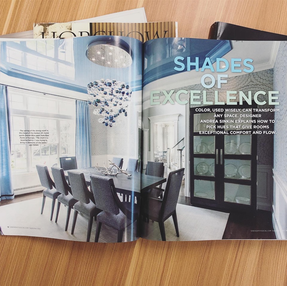
We are proud to announce that our work has been featured in the September edition of Serendipity Magazine. We worked alongside the talented Andrea Sinkin, founder of Andrea Sinkin Design, to create some spectacular high end finishes in this beautiful home. You can see through the pictures below the perfect blend of wallpaper and fine paint.
Color, used wisely, can transform any space. With the help of a professional, you can pick hues that give rooms exceptional comfort and flow.


Palette Pro. Beautifully done.

Happy Labor Day


Labor Day, the first Monday in September, is a creation of the labor movement and is dedicated to the social and economic achievements of American workers. It constitutes a yearly national tribute to the contributions workers have made to the strength, prosperity, and well-being of our country.

We would like to wish you a happy Labor Day.

Follow us on Facebook

Uplifting Pink Rooms

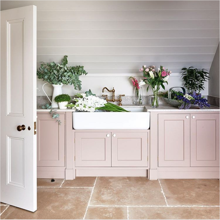
If you need some pink inspiration, check out these amazing pictures from Farrow & Ball. We can customize any tone of pink to make it perfect for your home or business. Contact us today to get your estimate.

1.Dead Salmon, a subtle shade whose name refers to the flat or ‘dead’ finish of an aged pink painted at Kedleston Hall in 1805, creates the most subtle and serene of environments. It has been used to great effect by @simshilditch on the cabinets in this beautiful utility room, along with our newest neutral School House White on the woodwork.


2.Rangwali, the most adventurous of our pinks, is incredibly friendly and takes its name from the powder which is thrown so enthusiastically during the Holi festival of colours in India. Though bright, it has an absorbing depth of colour which is achieved by adding a small dose of black pigment.


3.Mirror, mirror on the wall… what’s the fairest pink of them all? #SulkingRoomPink #FarrowandBall 📷 @lafotobelle via @madridboutiqueproperties


4. “After being advised by Farrow & Ball’s colour curator, Joa Studholme, to warm up my cool-grey walls with a splash of the new colour collection, I now have Sulking Room Pink from floor to ceiling. And guess what – it looks great. Cosier, softer, prettier – it’s amazing the transformation that a lick of paint can achieve” – @frankiegraddon.

This post was taken from Farrow & Ball website.

Memorial Day – Remember and Be Thankful

We would like to wish you and your family a good Memorial Day. May we always remember and keep our hearts grateful for those who fought for our country.

Memorial Day imposes a duty on all Americans to remember fallen heroes and to pray that no heroes will ever have to die for us again. It’s a day of thanks for the valor of others, a day to remember the splendor of America and those of her children who rest now.


Palette Pro. Beautifully done.

Home Exterior Color Ideas and Inspiration

When painting the exterior of your house and other outdoor features, you have two important characteristics to keep in mind: how well it lasts and how good it looks.


Painting a house is no small investment, so choosing the best paint color for the exterior surfaces of your house means picking colors that look great and last. We can help you select a durable paint that resists the punishing effects of weather and will last a long time. Check out this post from Benjamin Moore.


Foolproof Color Picks

To narrow down your color choices, build an exterior palette around the elements of the house that won’t change, such as roofing materials and stone or brick components. Pick contrasting but complementary colors to highlight architectural elements and add dimension. Similar color undertones will link the elements together.


Take a Look Around

The best inspiration may come from stepping outside. Select hues that are compatible with your neighborhood, architectural style and natural surroundings. For exterior colors inspired by classic American design and architecture, look no further than Benjamin Moore’s Historical Collection for tried and true favorites that are perfect for any home.


The Right Light

Just like interior paint colors, exterior colors shift depending on how the light hits them—and can look different when applied than they do on a chip. Make regret-free choices by buying a quart of paint and applying it on inconspicuous areas of all sides of your house. Visit your samples throughout the day until you’re comfortable with your choice.


Finish Lines

Color is only one aspect of an exterior paint choice; sheen is another important factor. Low Lustre finish is a top choice for the main siding color—the low-reflective finish adds a slight gloss, hides surface imperfections and cleans well. Semi-gloss paints add extra durability and clean up easily, making them a good choice for areas such as window sills that bear the brunt of weather shifts. High gloss finishes make color look richer but magnify surface imperfections.


Palette Pro. Beautifully done.


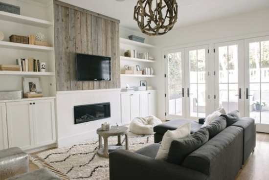
How to Decorate a Living Room

Whether your style is traditional or modern, relaxed or formal, bold or subdued, your living room should be a place where you can feel comfortable, let down your guard and spend quality time with friends, family or just yourself. There’s an art to decorating a room that looks great and works well for you. So before you dive into a living room redesign with your pro, arm yourself with a few designer tips and tricks. .

1) Mix light and dark. When a living room is all white and bright, it can feel too “clean” and unapproachable. When it’s all dark, it can feel like a cave. But mixing dark and light colors creates a dynamic look that has depth and balance. The design of any space benefits from the inclusion of at least a little white and a little black.


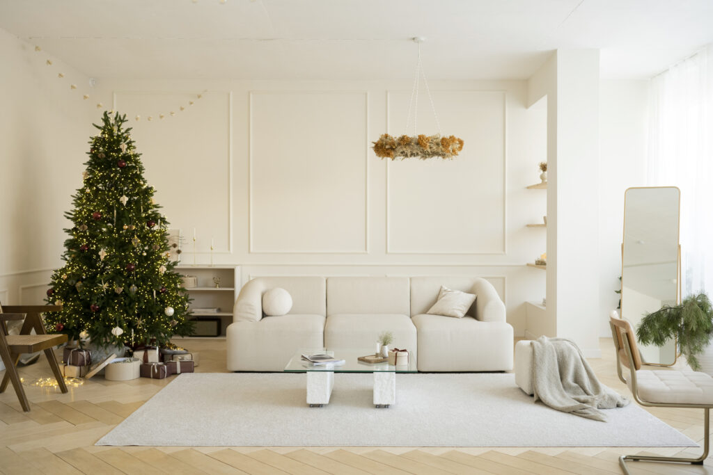
2) Contrast your neutrals. Beyond including some white and some black, decorating a living room with a variety of contrasting neutrals goes a long way toward making it feel rich and welcoming. In this example, the white walls, caramel leather, brass hardware, gray sofa and blue-gray cabinets all contrast with one another, which highlights their different finishes and undertones. This makes the palette feel rich even before other key elements, such as color, pattern and texture, are added.


3) Work in some wood. Wood is one of the top materials for bringing a sense of warmth to a living room.


4) Add a dash of color. While you can create a beautiful space without any vivid hues, adding even a little bit of color to a living room can go a long way toward creating a relaxed and inviting atmosphere. When in doubt, look to a cheerful blue — it’s a hue that usually everyone can agree on. It perfectly contrasts warm elements such as leather and wood, and it feels just neutral enough to work with basically any other future accent colors.


5) Consider conversational distances. No matter how big your living room, there’s a limit to how large a seating group can be and still make sense for intimate conversation and cozy gatherings. A good distance between seats to facilitate conversation is about 8 feet, meaning if you have several sofas or a sofa and side chairs, the seating area should have a diameter of 8 feet, or 4 feet out from the center.
A huge, 12-seat sectional sofa may look great and be perfect for a party, but if you’re looking to create a cozy living room, it’s usually best to use fewer, smaller seating pieces and push them a little closer together.


Palette Pro. Beautifully done.