Archive for the ‘Colors’ Category


Add Fresh Color and Style To Your Kitchen

Looking to liven up your culinary space? The kitchen is one of the most used and loved areas of the home and a new paint job can freshen up your look. To help you, we’ve compiled a list of three ways to add fresh color to your kitchen and make it stand out.

Two-Tone Kitchen Cabinets

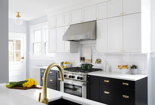
Single color kitchen cabinets are the most common and they are a good choice if blended in with the rest of the kitchen. However, two-tone kitchen cabinets are more attractive and make a great visual impact. This is a wonderful way to update your cabinets, and add a dash of fun. Sleek, white upper cabinets to brighten the space show a sophisticated look when paired with dark grey or black lower cabinets. Take a matte paint to your cabinets for a more rustic look. This softer look will offer a look of natural relaxation in your kitchen.


Set The Island Apart

If painting your cabinets two different colors isn’t the look for you, why not focus on your island? Contrasting islands are a great way to freshen the look of your kitchen and add your own personal flair. Although matching an island to surrounding cabinets and countertops creates symmetry within a kitchen, using different colors can turn an island into a beautiful focal point that complements the rest of your kitchen. Painting kitchen islands can be as relaxed or as bold as you want it to be. For a classic look, a dark grey or navy blue, with white kitchen cabinets is a great choice. However, for a truly vivid pop of color, you could always GO BOLD, like this island.


Accent Walls

An accent wall serves many useful purposes in a room. It can help define a space, bring attention to architectural details and focal points. It also adds interest and drama with vibrant color, eye-catching patterns or rich, earthy textures. If you like the traditional look of your kitchen, adding an accent wall is a quick way to brighten up your space.


Bonus Tip!!


Upgrade your hardware

When it comes to a quick and easy update that makes a massive difference in the style of your kitchen, hardware ranks right at the top. It can be changed out in just a few hours, yet transforms the entire appearance and feeling of a space. Think of how the perfect necklace tops off a plain dress, or how a precisely kicked field goal can win the Superbowl. When it comes to an easy kitchen update, new hardware can transform a space from ‘blah’ to beautiful!


No matter what your option is, Palette Pro can help you get the look you want to your kitchen. If you are ready to work with a professional cabinet craftsman, please contact or call us today at 1-800-687-9470 for your in-home, no obligation appointment.


Palette Pro. Beautifully done.

Award Winning Dining Room

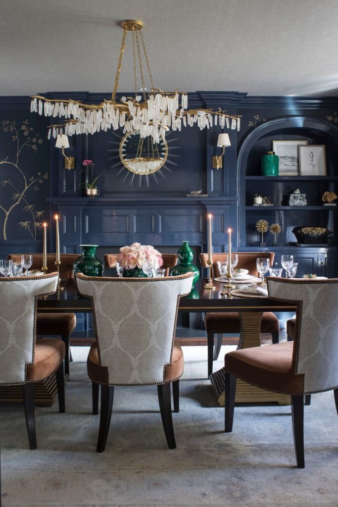
Our application of Fine Paints of Europe was recently featured in the 2019 Serendipity Design Innovator Award. We worked with the talented Rajni Alex Design on the application of Fine Paints of Europe Hollandlac Brilliant on all of the millwork in this Bronxville NY dining room. The project took approximately three weeks from start to finish, and entailed a great deal of prep work and spray application of high gloss finish. Our craftsmen did a tremendous job and their attention to detail was meticulous. All the colors and wallpaper caught the true essence of this dining room bringing it to life.

With that, we would also like to Congratulate Rajni Alex Design for winning the 2019 Serendipity Design Innovator Award for Statement Dining Room. It indeed is a statement piece.


If you are interested in having a room in your home beautifully done like this one please check out our website or call us today at 1-800-687-9470 for your free, no obligation appointment.


Palette Pro. Beautifully done.

Benjamin Moore’s 2020 Color of the Year


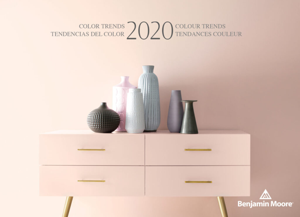
Benjamin Moore & Co. has recently revealed its Color of the Year 2020, a warm, blushy pink named First Light. It’s the company’s first time choosing a pink hue for Color of the Year, bringing the optimistic vibe that people are craving in their lives today as well as a feeling of comfort.


“It’s going to be the new decade, and we knew this was a big moment for us to do something interesting,” says Hannah Yeo, Color & Design Manager at Benjamin Moore & Co. “Today’s changing technology, environmental concerns, and cultural and economic influences are all shaping how we live. More than ever, we expect the home to provide security, comfort, community, self-expression, and optimism. So we said, what are some of the colors that would really help with that?”

With that mindset, the company was able to arrive at First Light as well as its Color Trends 2020 Palette, which consists of a selection of pastels including jade-green Crystalline AF-485; sky-blue Windmill Wings 2067-60; and sunny Golden Straw 2152-50, among others. The trend toward expressive, saturated colors signifies a departure from the more subdued Color of the Year 2019.


“Now, let’s use color to express ourselves, be a little more upbeat, and happy,” she concludes. “We all need that optimism in our lives.”


We invite you to take a look at the wonderful collection of colors that Benjamin Moore has to offer as well as scheduling an appointment with our Color Consultant to help you find the color that best fits your lifestyle.


Palette Pro. Beautifully done.

6 Tips to Selecting Your Paint Color

Painting the inside of your house starts with a difficult choice: Just what colors are you going to use (exterior paints can also be a challenge)? If you’re not sure where to begin, we have a few suggestions for you to make sure your colors are everything you need them to be. Get your project out of the paper and get a quote for your project.


1. Start With an Existing Piece
When picking paint colors, especially interior palettes, one of the best routes to take is finding an existing piece you really, really love. This could be a piece of art, a beloved bedspread, or even a section of beautiful natural wood. You can then use this piece as a jumping off point: What colors complement the piece the most? Which match it? Which will bring out its best characteristics? You now have a number of shades to work with! If you are working with an empty house instead, look for a piece of inspiration online or in magazines that you can use in a similar way.

2. Use the Color Wheel
The color wheel is a basic tool that shows you what colors complement or contrast each other. It’s a great way to make sure that you don’t choose colors that look good in the moment, but actually clash or bring out the worst in each other. Even casual renovations or painting projects should utilize the color wheel to find effective options and avoid mistakes.

3. When in Doubt, Go Neutral
Often, neutral colors are better choices for most indoor paint colors. That’s because there are always other things to draw in the eye inside the house: Beautiful countertops, wood floors, carefully chosen furniture, murals, and so on. Neutral colors like grays, soft whites, and creamy shades will enhance these other aspects of your house without drawing too much attention to themselves. They also tend to look great with natural light!

4. Look for Easy Monochromatic Options
Monochromatic color palettes mean choosing a single base color, and then using a few different shades based off that color – some lighter, and some darker. This allows you to use darker or lighter colors in certain areas of your home while still making sure that everything matches.

5. Don’t Choose Too Many Colors
Remember, many homes already have focal points like floors or furniture to draw the eye. Choosing too many colors for your house can make it feel very cluttered, confused, and ultimately unpleasant. The eye won’t know where to look! So stick to two or possibly three colors in a particular area.

6. Pay Attention to Finishes
Remember, the right finish can add an extra dynamic to your paint colors. Usually, this means choosing a level of “sheen” from flat to high gloss. Which will work better for your home? Glossy paints tend to reflect more light, but they are also more noticeable. Different rooms may benefit from different sheens, or you could choose one sheen for the entire house.

Still having trouble making up your mind? That’s completely normal – but we can help! Call Palette Pro today and get a color consultation. We’ll go over your own needs and plans to find a color scheme that’s just right for your house.


Palette Pro. Beautifully done.

Commercial – Residential Building Painting

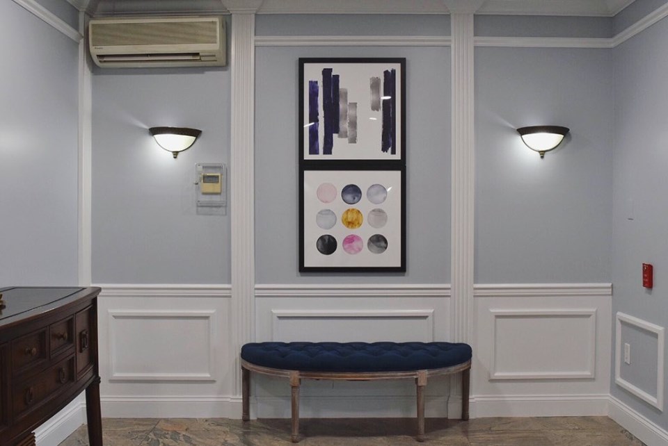
Take a look at our latest project. By simply painting the entryway and hallways, this residential building got a fresh and modern look. For any commercial projects, you should hire a trustworthy company who is licenced and insured, in order to deliver a flawless job.


Uplifting Pink Rooms

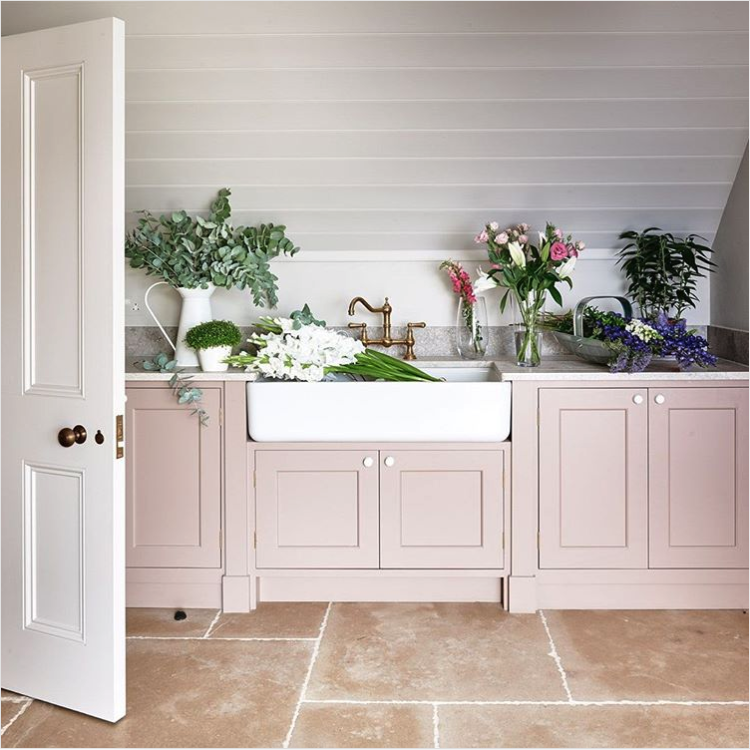
If you need some pink inspiration, check out these amazing pictures from Farrow & Ball. We can customize any tone of pink to make it perfect for your home or business. Contact us today to get your estimate.

1.Dead Salmon, a subtle shade whose name refers to the flat or ‘dead’ finish of an aged pink painted at Kedleston Hall in 1805, creates the most subtle and serene of environments. It has been used to great effect by @simshilditch on the cabinets in this beautiful utility room, along with our newest neutral School House White on the woodwork.


2.Rangwali, the most adventurous of our pinks, is incredibly friendly and takes its name from the powder which is thrown so enthusiastically during the Holi festival of colours in India. Though bright, it has an absorbing depth of colour which is achieved by adding a small dose of black pigment.


3.Mirror, mirror on the wall… what’s the fairest pink of them all? #SulkingRoomPink #FarrowandBall 📷 @lafotobelle via @madridboutiqueproperties


4. “After being advised by Farrow & Ball’s colour curator, Joa Studholme, to warm up my cool-grey walls with a splash of the new colour collection, I now have Sulking Room Pink from floor to ceiling. And guess what – it looks great. Cosier, softer, prettier – it’s amazing the transformation that a lick of paint can achieve” – @frankiegraddon.

This post was taken from Farrow & Ball website.

How to Match Your Wood Floors to Your Personality

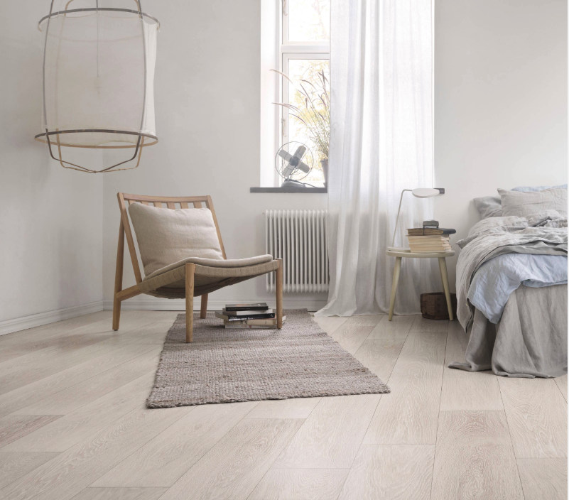
Do you yearn to dig your toes in the sand and let sea breezes waft through your hair? Perhaps you prefer the tinkle of crystal to the sound of the waves and you’d much rather be in black tie than swimwear. Or maybe the bright lights and art scene of the big city beckon. Whatever your taste, it’s time to revamp your tired wood flooring with finishes and stains that suit your personality.

Comfortably Natural

Home Exterior Color Ideas and Inspiration

When painting the exterior of your house and other outdoor features, you have two important characteristics to keep in mind: how well it lasts and how good it looks.


Painting a house is no small investment, so choosing the best paint color for the exterior surfaces of your house means picking colors that look great and last. We can help you select a durable paint that resists the punishing effects of weather and will last a long time. Check out this post from Benjamin Moore.


Foolproof Color Picks

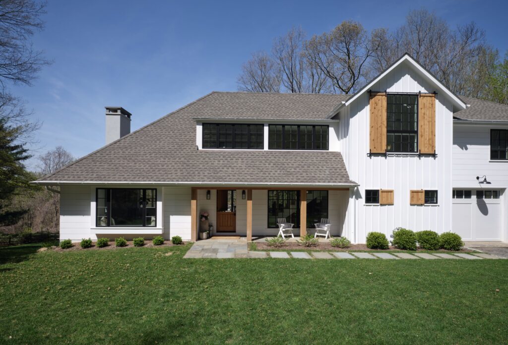
To narrow down your color choices, build an exterior palette around the elements of the house that won’t change, such as roofing materials and stone or brick components. Pick contrasting but complementary colors to highlight architectural elements and add dimension. Similar color undertones will link the elements together.


Take a Look Around

The best inspiration may come from stepping outside. Select hues that are compatible with your neighborhood, architectural style and natural surroundings. For exterior colors inspired by classic American design and architecture, look no further than Benjamin Moore’s Historical Collection for tried and true favorites that are perfect for any home.


The Right Light

Just like interior paint colors, exterior colors shift depending on how the light hits them—and can look different when applied than they do on a chip. Make regret-free choices by buying a quart of paint and applying it on inconspicuous areas of all sides of your house. Visit your samples throughout the day until you’re comfortable with your choice.


Finish Lines

Color is only one aspect of an exterior paint choice; sheen is another important factor. Low Lustre finish is a top choice for the main siding color—the low-reflective finish adds a slight gloss, hides surface imperfections and cleans well. Semi-gloss paints add extra durability and clean up easily, making them a good choice for areas such as window sills that bear the brunt of weather shifts. High gloss finishes make color look richer but magnify surface imperfections.


Palette Pro. Beautifully done.


Twin Bedroom Transformation


It’s pastel heaven in this twin girls bedroom we had the pleasure to work on. We took this bedroom from gloomy and dark, to a bright and airy atmosphere. The results made our little clients thrilled. Check out the before and after pictures.

Before

After

Before

After

After

After

After

After

Palette Pro. Beautifully done.


Sherwin Williams Color Of The Year 2018

Sherwin-Williams reveals it’s 2018 color of the year and it’s ‘the color of wanderlust.

The paint company revealed that “Oceanside” will be their Color of the Year. Inspired by travel, the blue-green hue will add an air of mystery and elegance to any space.

“People today have a growing sense of adventure, and it is making its way into even the coziest corners of our homes. We are craving things that remind us of bright folklore, like mermaids and expeditions across continents,” said Sue Wadden, director of color marketing. “Oceanside is the color of wanderlust right in our own homes.”


Let us know if it’s time for a interior painting change.

Palette Pro. Beautifully done.