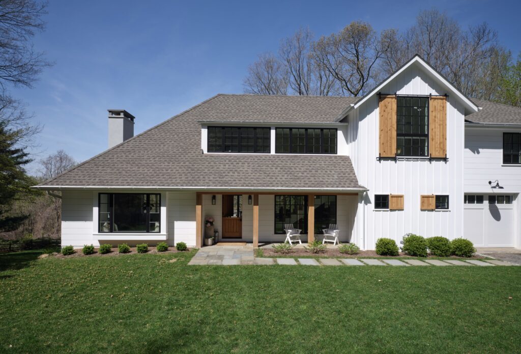
Archive for the ‘Home Renovation’ Category
Add Fresh Color and Style To Your Kitchen
Looking to liven up your culinary space? The kitchen is one of the most used and loved areas of the home and a new paint job can freshen up your look. To help you, we’ve compiled a list of three ways to add fresh color to your kitchen and make it stand out.
Two-Tone Kitchen Cabinets
Single color kitchen cabinets are the most common and they are a good choice if blended in with the rest of the kitchen. However, two-tone kitchen cabinets are more attractive and make a great visual impact. This is a wonderful way to update your cabinets, and add a dash of fun. Sleek, white upper cabinets to brighten the space show a sophisticated look when paired with dark grey or black lower cabinets. Take a matte paint to your cabinets for a more rustic look. This softer look will offer a look of natural relaxation in your kitchen.

Set The Island Apart
If painting your cabinets two different colors isn’t the look for you, why not focus on your island? Contrasting islands are a great way to freshen the look of your kitchen and add your own personal flair. Although matching an island to surrounding cabinets and countertops creates symmetry within a kitchen, using different colors can turn an island into a beautiful focal point that complements the rest of your kitchen. Painting kitchen islands can be as relaxed or as bold as you want it to be. For a classic look, a dark grey or navy blue, with white kitchen cabinets is a great choice. However, for a truly vivid pop of color, you could always GO BOLD, like this island.

Accent Walls
An accent wall serves many useful purposes in a room. It can help define a space, bring attention to architectural details and focal points. It also adds interest and drama with vibrant color, eye-catching patterns or rich, earthy textures. If you like the traditional look of your kitchen, adding an accent wall is a quick way to brighten up your space.

Bonus Tip!!
Upgrade your hardware
When it comes to a quick and easy update that makes a massive difference in the style of your kitchen, hardware ranks right at the top. It can be changed out in just a few hours, yet transforms the entire appearance and feeling of a space. Think of how the perfect necklace tops off a plain dress, or how a precisely kicked field goal can win the Superbowl. When it comes to an easy kitchen update, new hardware can transform a space from ‘blah’ to beautiful!
No matter what your option is, Palette Pro can help you get the look you want to your kitchen. If you are ready to work with a professional cabinet craftsman, please contact or call us today at 1-800-687-9470 for your in-home, no obligation appointment.
Painting Hope – Breast Cancer Awareness Month

October is Breast Cancer Awareness Month and that means it is time for Palette Pro’s Annual Painting Hope Project.
Firstly, what is Breast Cancer Awareness?
Breast Cancer Awareness is a campaign that originated in October of 1985, as a weeklong event, that reached a worldwide proportion. The main objective is to spread the word as to why it’s important to perform self-examinations and do regular routine check-ups in order to prevent or, at least, detect any signs of Breast Cancer.
Since 1989, up until 2016, the numbers of deaths caused from Breast Cancer has dropped 40%, gradually dropping till this day, all thanks to awareness methods attributed to improving early detection, according to National Breast Cancer Foundation, INC.
Now, you must be wondering, what is Painting Hope?
Painting Hope was created with the mission to enrich the lives of families affected by breast cancer. The message is simple, it is about letting someone know their value, their place, and significance even in the middle of a stifling experience.
Rodrigo Vasconcellos started Painting Hope in 2015 as a way to make a difference in the community during Breast Cancer Awareness month. His motivations aren’t entirely born out of an altruistic spirit, disconnected from personal experiences. He too has been intimately affected by breast cancer and its ripple effects. Sonia, his mother, a survivor, warrior and graceful human being with far too many qualities to list, is the fuel behind our courage, the thought behind the action, the reason for the deed. Her life’s mission was to care for others, and in her death, we commit to living out that mission. Where cancer once promoted despair we intend to combat it with hope, in her name, in her true essence.
Each year in October, we ask our local community and clients to submit stories of someone they know who has been battling Breast Cancer or has recently been affected by Breast Cancer and is in need of painting but can’t afford it. Once these stories are submitted, the Palette Pro Team will vote on the top candidates and announce the winner soon after. Therefore, The recipient will be awarded up to $10,000 worth of free painting services. Our employees, friends, and family volunteer their time to the recipient. A freshly painted home can brighten their outlook and bring joy into their lives.
Check out a short video of our first Painting Hope project below.
As we begin planning for our next Painting Hope Project, we would like to invite you to help us spread the word, nominate someone that is currently battling cancer or is in some way affected by it. Here’s how it works, please click here to fill out the form to submit an entry or contact us if you would like to be part of this year’s Painting Hope Project.
Palette Pro. Beautifully done.
no images were found
Shades Of Excellence
We are proud to announce that our work has been featured in the September edition of Serendipity Magazine. We worked alongside the talented Andrea Sinkin, founder of Andrea Sinkin Design, to create some spectacular high end finishes in this beautiful home. You can see through the pictures below the perfect blend of wallpaper and fine paint.Color, used wisely, can transform any space. With the help of a professional, you can pick hues that give rooms exceptional comfort and flow.


Palette Pro. Beautifully done.
6 Tips to Selecting Your Paint Color
Painting the inside of your house starts with a difficult choice: Just what colors are you going to use (exterior paints can also be a challenge)? If you’re not sure where to begin, we have a few suggestions for you to make sure your colors are everything you need them to be. Get your project out of the paper and get a quote for your project.
1. Start With an Existing Piece
When picking paint colors, especially interior palettes, one of the best routes to take is finding an existing piece you really, really love. This could be a piece of art, a beloved bedspread, or even a section of beautiful natural wood. You can then use this piece as a jumping off point: What colors complement the piece the most? Which match it? Which will bring out its best characteristics? You now have a number of shades to work with! If you are working with an empty house instead, look for a piece of inspiration online or in magazines that you can use in a similar way.
2. Use the Color Wheel
The color wheel is a basic tool that shows you what colors complement or contrast each other. It’s a great way to make sure that you don’t choose colors that look good in the moment, but actually clash or bring out the worst in each other. Even casual renovations or painting projects should utilize the color wheel to find effective options and avoid mistakes.
3. When in Doubt, Go Neutral
Often, neutral colors are better choices for most indoor paint colors. That’s because there are always other things to draw in the eye inside the house: Beautiful countertops, wood floors, carefully chosen furniture, murals, and so on. Neutral colors like grays, soft whites, and creamy shades will enhance these other aspects of your house without drawing too much attention to themselves. They also tend to look great with natural light!
4. Look for Easy Monochromatic Options
Monochromatic color palettes mean choosing a single base color, and then using a few different shades based off that color – some lighter, and some darker. This allows you to use darker or lighter colors in certain areas of your home while still making sure that everything matches.
5. Don’t Choose Too Many Colors
Remember, many homes already have focal points like floors or furniture to draw the eye. Choosing too many colors for your house can make it feel very cluttered, confused, and ultimately unpleasant. The eye won’t know where to look! So stick to two or possibly three colors in a particular area.
6. Pay Attention to Finishes
Remember, the right finish can add an extra dynamic to your paint colors. Usually, this means choosing a level of “sheen” from flat to high gloss. Which will work better for your home? Glossy paints tend to reflect more light, but they are also more noticeable. Different rooms may benefit from different sheens, or you could choose one sheen for the entire house.
Still having trouble making up your mind? That’s completely normal – but we can help! Call Palette Pro today and get a color consultation. We’ll go over your own needs and plans to find a color scheme that’s just right for your house.

Palette Pro. Beautifully done.
Have Questions About Refinishing Your Deck?
We Have the Answers:
Everyone appreciates the charm and natural beauty of a classic wooden deck. But in order to maintain one, it is important to take care of the wood and properly maintain the finish. To extend the life of your outdoor living space, there are a few things you need to know about the care and preservation of your deck:
What are the benefits of maintaining the finish on my deck?

Precipitation, sunlight, and fluctuating temperatures—all things will eventually wear down the protective layer on the wood, even when it’s treated with the best varnish. Refinishing the wood is necessary for lengthening the life of your patio. The finish works as a sealant that prevents moisture from penetrating the wood, which defends it from warping and mildew damage, and protects it from the sun, preserving the color and natural beauty of your deck.
How do I tell if my deck needs refinishing?
As time passes, the dry climate and varying weather conditions will deteriorate the finish of a wooden deck. Look for spots where the color of the wood has changed and the varnish has worn off, and then try sprinkling water to see if it will absorb quickly. If it’s absorbed, it’s time for refinishing. Also, warping and cracking of the panels is a sure sign that it’s time to re-stain your desk. However, it’s important to maintain the finish on your deck even when there isn’t any apparent damage.
When should I get it refinished?
If you find that your deck must be refinished, don’t put it off until the dry winter or the intense heat of the summer. As the humidity decreases with the seasonal changes, the wood may dry out or crack, and get damaged even more. The best thing to do is to have your deck checked for any damage or wear and have it refinished before the terribly dry or hot seasons hit. Depending on the age and thickness of the wood, you may want to give the wood extra maintenance and care for it to retain its finish.
Contact us now for your free estimate.

Stunning Bathrooms By Palette Pro
There is nothing better than getting home after a long day and enjoy a warm shower or a nice bubbly bath, to relax and wash away all the stress accumulated from the day. These are some of our favorite bathroom renovation projects we did recently. Our clients were amazed with the results and so were we.Our goal is to provide you with the highest quality service. We do this by combining traditional hard work and professionalism with modern techniques and materials.
Take a look at why you should consider us for your next renovation or painting project.
https://palette-pro.com/hire-palette-pro/


Palette Pro. Beautifully done.
Uplifting Pink Rooms
If you need some pink inspiration, check out these amazing pictures from Farrow & Ball. We can customize any tone of pink to make it perfect for your home or business. Contact us today to get your estimate.1.Dead Salmon, a subtle shade whose name refers to the flat or ‘dead’ finish of an aged pink painted at Kedleston Hall in 1805, creates the most subtle and serene of environments. It has been used to great effect by @simshilditch on the cabinets in this beautiful utility room, along with our newest neutral School House White on the woodwork.

2.Rangwali, the most adventurous of our pinks, is incredibly friendly and takes its name from the powder which is thrown so enthusiastically during the Holi festival of colours in India. Though bright, it has an absorbing depth of colour which is achieved by adding a small dose of black pigment.

3.Mirror, mirror on the wall… what’s the fairest pink of them all? #SulkingRoomPink #FarrowandBall 📷 @lafotobelle via @madridboutiqueproperties

4. “After being advised by Farrow & Ball’s colour curator, Joa Studholme, to warm up my cool-grey walls with a splash of the new colour collection, I now have Sulking Room Pink from floor to ceiling. And guess what – it looks great. Cosier, softer, prettier – it’s amazing the transformation that a lick of paint can achieve” – @frankiegraddon.

How to Match Your Wood Floors to Your Personality
Do you yearn to dig your toes in the sand and let sea breezes waft through your hair? Perhaps you prefer the tinkle of crystal to the sound of the waves and you’d much rather be in black tie than swimwear. Or maybe the bright lights and art scene of the big city beckon. Whatever your taste, it’s time to revamp your tired wood flooring with finishes and stains that suit your personality.Comfortably Natural

Home Exterior Color Ideas and Inspiration
When painting the exterior of your house and other outdoor features, you have two important characteristics to keep in mind: how well it lasts and how good it looks.
Painting a house is no small investment, so choosing the best paint color for the exterior surfaces of your house means picking colors that look great and last. We can help you select a durable paint that resists the punishing effects of weather and will last a long time. Check out this post from Benjamin Moore.

Foolproof Color Picks
To narrow down your color choices, build an exterior palette around the elements of the house that won’t change, such as roofing materials and stone or brick components. Pick contrasting but complementary colors to highlight architectural elements and add dimension. Similar color undertones will link the elements together.

Take a Look Around
The best inspiration may come from stepping outside. Select hues that are compatible with your neighborhood, architectural style and natural surroundings. For exterior colors inspired by classic American design and architecture, look no further than Benjamin Moore’s Historical Collection for tried and true favorites that are perfect for any home.

The Right Light
Just like interior paint colors, exterior colors shift depending on how the light hits them—and can look different when applied than they do on a chip. Make regret-free choices by buying a quart of paint and applying it on inconspicuous areas of all sides of your house. Visit your samples throughout the day until you’re comfortable with your choice.

Finish Lines
Color is only one aspect of an exterior paint choice; sheen is another important factor. Low Lustre finish is a top choice for the main siding color—the low-reflective finish adds a slight gloss, hides surface imperfections and cleans well. Semi-gloss paints add extra durability and clean up easily, making them a good choice for areas such as window sills that bear the brunt of weather shifts. High gloss finishes make color look richer but magnify surface imperfections.

Palette Pro. Beautifully done.
Giving Back to John Monaco for Decades of Service

The year 1943 seems like distant history for many, but for one member of the PDCA community, it was a life-changing year. John Monaco had just returned home from the army, and he was searching for the next phase of his life. He knew he needed to get set up with the right career and start to move in a positive direction.
After talking with his father, John decided to start working at the painting business his grandfather started in 1906, Beverly Painters & Decorating Inc., formerly known as Henry Monaco Painting. Despite being a third-generation contractor, John knew nothing about painting or business. He spent some time working with his father and learning the trade, then he turned to PDCA, which turned out to be one of the most valuable resources to start and maintain his career.
John spent years attending PDCA seminars and meetings, learning from industry leaders and making valuable connections. He found that other contractors always had the answers he was looking for and would offer any assistance they could provide.


The help he received from PDCA allowed him to be involved with his family business for many years, eventually taking over in the late 1970s.
John went on to help other contractors by being involved with local chapters and giving back to the community. He was the President of Westchester Chapter of PDCA on three different occasions in the 1980s.
Recently, John, who is now retired, needed the exterior of his home painted. He called Ray Rahni of Paint Track for an estimate. As a thank-you to John’s years of service, Ray organized a group of PDCA members to come complete the job free of charge.
The crew joined together, regardless of their company, for two days to complete the job. About 14 workers from various painting companies in the area, including Palette Pro Painting & Renovation. All volunteered together to paint the exterior of John’s home.


As the team finished the job, John was moved by the work everyone had done. This project is a testament to the extraordinary community that comes along with a PDCA membership. No matter how busy life can get, members of the community are always willing to come together to help out another member, like John.
At the beginning of his career, John found the answers and support he was looking for from PDCA. He later moved to become the giver and help other contractors in the association. Many years later, John is still seeing the tremendous benefits PDCA provides and the compassion of many members.
After all of his experience with the association, John Monaco said, “All you need in your tool case is PDCA.”
Repost from https://pdca.org/blog/members-give-back-to-john-monaco/