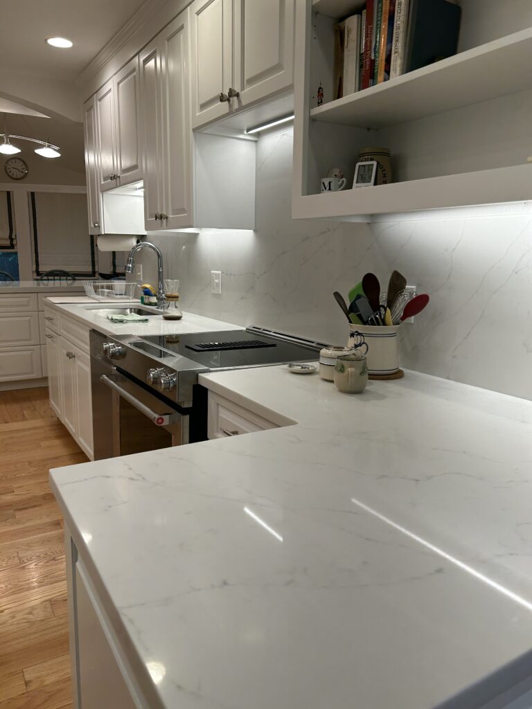
Posts Tagged ‘home renovation’


Award Winning Dining Room

Our application of Fine Paints of Europe was recently featured in the 2019 Serendipity Design Innovator Award. We worked with the talented Rajni Alex Design on the application of Fine Paints of Europe Hollandlac Brilliant on all of the millwork in this Bronxville NY dining room. The project took approximately three weeks from start to finish, and entailed a great deal of prep work and spray application of high gloss finish. Our craftsmen did a tremendous job and their attention to detail was meticulous. All the colors and wallpaper caught the true essence of this dining room bringing it to life.

With that, we would also like to Congratulate Rajni Alex Design for winning the 2019 Serendipity Design Innovator Award for Statement Dining Room. It indeed is a statement piece.


If you are interested in having a room in your home beautifully done like this one please check out our website or call us today at 1-800-687-9470 for your free, no obligation appointment.


Palette Pro. Beautifully done.

Benjamin Moore’s 2020 Color of the Year


Benjamin Moore & Co. has recently revealed its Color of the Year 2020, a warm, blushy pink named First Light. It’s the company’s first time choosing a pink hue for Color of the Year, bringing the optimistic vibe that people are craving in their lives today as well as a feeling of comfort.


“It’s going to be the new decade, and we knew this was a big moment for us to do something interesting,” says Hannah Yeo, Color & Design Manager at Benjamin Moore & Co. “Today’s changing technology, environmental concerns, and cultural and economic influences are all shaping how we live. More than ever, we expect the home to provide security, comfort, community, self-expression, and optimism. So we said, what are some of the colors that would really help with that?”

With that mindset, the company was able to arrive at First Light as well as its Color Trends 2020 Palette, which consists of a selection of pastels including jade-green Crystalline AF-485; sky-blue Windmill Wings 2067-60; and sunny Golden Straw 2152-50, among others. The trend toward expressive, saturated colors signifies a departure from the more subdued Color of the Year 2019.


“Now, let’s use color to express ourselves, be a little more upbeat, and happy,” she concludes. “We all need that optimism in our lives.”


We invite you to take a look at the wonderful collection of colors that Benjamin Moore has to offer as well as scheduling an appointment with our Color Consultant to help you find the color that best fits your lifestyle.


Palette Pro. Beautifully done.

Modern House In Greenwich

We had the pleasure to work on this Greenwich waterfront project. The results were beyond our client’s expectations and we loved every detail of it. Here is a round of photos of the interior. Stay tuned for our future posts with more pictures.


Palette Pro. Beautifully done.

How to Pick Exterior House Colors for Your Home

Your home is your most significant investment, and making significant changes to it can lead to uncertainty — significant changes like the exterior paint color. You want your house to look and feel beautiful and welcoming. With an endless amount of paint colors, it can be difficult to know where to begin.

Unfortunately, you can’t always pick a paint color just because you like it. Let your home’s existing architecture help inform your decision. For a colonial or mid-century-styled home, you’ll want a classic rather than modern color. And the same goes for a contemporary home — you’ll want a contemporary shade. Many paint providers offer historically accurate colors to help you get started. Beyond just your home’s architecture, consider the neighborhood you live in and even the region, as these environmental factors could and should influence your decision.

How Many Colors Do You Need?

When thinking about the exterior of your home, you really need three paint colors: a field or main color, a trim color for awnings, windows and door frames and an accent color for doors and shutters. Let your field and trim colors work in tandem but in contrast. It’s best to choose a light field color and darker trim color or vice versa. Feel free to be creative and adventurous with your accent color, but don’t take a bright color too far. It’s sometimes OK to use an accent color on a door alone.

Here are some color theme suggestions based on how you would like to paint your home.

Monochromatic


A Monochromatic scheme can either be simple and understated or dramatic. Choosing a siding, trim, and shutter color all from the same paint strip is a monochromatic scheme that will always work visually on any exterior. A bold monochromatic scheme is doing a deep rich color on the entire body of an exterior.

Analogous


An analogous color scheme uses adjacent colors on the color wheel. This color scheme works well on exteriors that have either stone or brick as a part of their exterior facade. It is a great way to pull out the natural colors in the stone onto the rest of the facade.

Complimentary


A Complimentary color scheme is a scheme that involves two colors that are opposite from one another on the color wheel. This is a great choice for a home that has siding and shutters and little additional exterior architectural detail. By choosing opposite colors on the color wheel, you can make the small details of your home stand out their most.

Tridad


A tridad color scheme includes any three colors equally spaced on the color wheel. While this may seem like a very bold scheme, it doesn’t have to be. Imagine a creamy yellow home with navy shutters and a red door.
No matter how many colors you are looking for , follow these guidelines to get a great look!

What Exterior Features Are You Working Around?

The best colors for the exterior of your home should be based on the exterior features of your home that are most difficult to change — driveways, pathways, stonework, shingles, tiles, etc. Search among these hard-to-change features for warm or cool undertones, and then work to complement those existing shades. Cool colors include blues and grays, while warmer colors will be beige, khaki or tend toward other browns.

How Is Your Home Positioned on the Street?

It’s important to consider whether your home is set back a distance from the street or set right near it. It’s also important to consider how much cover you get from trees around your home, or how much natural light you get in a treeless yard. If your home is set back off the street and surrounded by trees, you may want to choose a lighter, brighter color to help your home stand out.

How Does the Paint Look on Your Home?

You can’t make a decision based on a sample card alone. Buy a quart of paint and apply it on a difficult-to-see portion of your home. Make sure to look at it during different times of day to see how light and conditions affect it. Once you’re comfortable with the look and feel of the paint and the way it jives with your home and neighborhood, you’ve found your winner.

We will be more than happy to help you decide on the best paint option for your house. We also offer a free Color Consultation to guide you thru this decision. Our skilled team offers high-quality painting jobs that combine your preferences with our years of experience. Palette Pro also handles projects of every scale; no job is too small or too big for us. Trust us to deliver 100% customer satisfaction whenever, wherever.


Palette Pro. Beautifully done.

Houzz – Best Customer Service Award

Palette Pro Painting & Renovation of White Plains Awarded Best Of Houzz 2017


best of houzz 2017 badge

Over 40 Million Monthly Unique Users Nominated Best Home Building, Remodeling and Design Professionals in North America and Around the World.

White Plains, USA, January 19, 2017 – Palette Pro Painting & Renovation of White Plains has won “Best Of Customer Service” on Houzz®, the leading platform for home remodeling and design. Palette Pro is a premiere Painting & Renovation company with over 15 years of experience. With a reputation as the premiere, dependable, service-oriented company. It was chosen by the more than 40 million monthly unique users that comprise the Houzz community from among more than one million active home building, remodeling and design industry professionals.
The Best Of Houzz is awarded annually in three categories: Design, Customer Service and Photography. Design award winners’ work was the most popular among the more than 40 million monthly users on Houzz. Customer Service honors are based on several factors, including the number and quality of client reviews a professional received in 2016. Architecture and interior design photographers whose images were most popular are recognized with the Photography award. A “Best Of Houzz 2017” badge will appear on winners’ profiles, as a sign of their commitment to excellence. These badges help homeowners identify popular and top-rated home professionals in every metro area on Houzz.

“We’re so pleased to award Best of Houzz 2017 to this incredible group of talented and customer-focused professionals, including Palette Pro Painting & Renovation,” said Liza Hausman, vice president of Industry Marketing for Houzz. “Each of these businesses was singled out for recognition by our community of homeowners and design enthusiasts for helping to turn their home improvement dreams into reality.” Follow Palette Pro on Houzz https://www.houzz.com/pro/palettepro/palette-pro

IMG_8454
Palette Pro works meticulously to maintain its distinguished reputation for providing years of quality service, exceptional work and complete customer satisfaction in the residential painting and renovation industry. Our goal is to provide you with the highest quality service. We do this by combining traditional hard work and professionalism with modern techniques and materials. We treat your home or work space as if it was our own, delivering a flawless finish, on time, every time. We’ll leave your home or office beautifully done; on-quote and on-time.


We would like to thank all of our customers for choosing Palette Pro. It is our pleasure to make your homes beautiful.

Palette Pro. Beautifully done.

Decorating With Shiplap

If you never heard this term before, you probably don’t follow the show ‘Fixer Upper’ on HGTV. It is amazing to see how creative Chip and Joanna are. They have inspired so many people with this trend that they incorporate in almost every house they renovate. So, what exactly is shiplap? Shiplap is a kind of wooden board that’s often used for constructing sheds, barns, and other rustic buildings. Traditional shiplap has a rabbet (or groove) cut into the top and bottom, which allows the pieces to fit together snugly, forming a tight seal. This also gives shiplap its distinctive appearance, with subtle horizontal reveals between each piece. Lately shiplap has become a popular choice for interior finishes, thanks to its rustic charm and subtle texture. It’s a great way to add a little character to any room. Check out some pictures to inspire you and call us if you need a hand.

1. Entry shiplap entryway 1
2. Sitting Room
shiplap sitting room
3. Fireplace Surround
shiplap fireplace
4. Living Room
living room shiplap
5. Kitchen
shiplap kitchen
6. Dining Room
shiplap dining room
7. Stairway
shiplap staircase
8. Bedroom
shiplap bedroom
9. Bathroom
shiplap bathroom
10.Accent Wall
shiplap accent wall

Using shiplap will create a warm, beautiful and inviting home. Feel free to reach us at 1-800-687-9470 to get a quote for your project.

Palette Pro. Beautifully done.