Elevate Your Space: Budget-Friendly Renovation Ideas
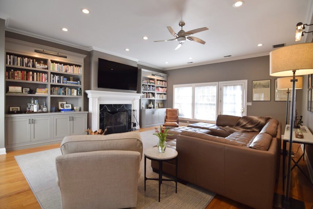
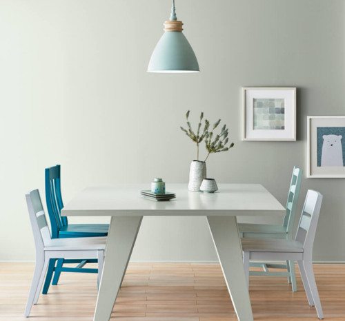
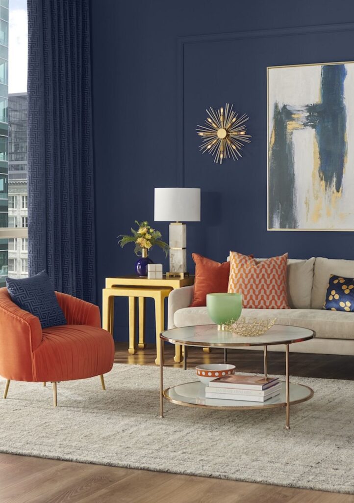
Embarking on a home makeover journey is an exciting endeavor, and the good news is that you don’t need to worry about breaking the bank. Our exploration of creative and cost-effective renovation ideas opens the door to a world where budget-friendly transformations breathe new life into your space. Let’s explore some creative and cost-effective ways to refresh your home. …