“Color is an universal, nonverbal language, and we all intuitively know how to speak it.” Leslie H.
Can you imagine the world being black and white? Well, it wouldn’t be so pleasant and vivid. We believe that it’s all about colors. There are uncountable options of colors to choose for your home, but how should you select colors that work together smoothly?
Today’s post is inspired by Benjamin Moore’s website and here is a simple explanation on how to harmonize colors.
‘Experts compiled colors that share one or more key color trait—hue, chroma or value. Hue is the basic color family. Value describes how light or dark a color is. While chroma (or saturation) is the intensity of color. Colors in the same hue that vary in value will always work harmoniously. Same with colors with similar chroma, even if they are different in hue.’
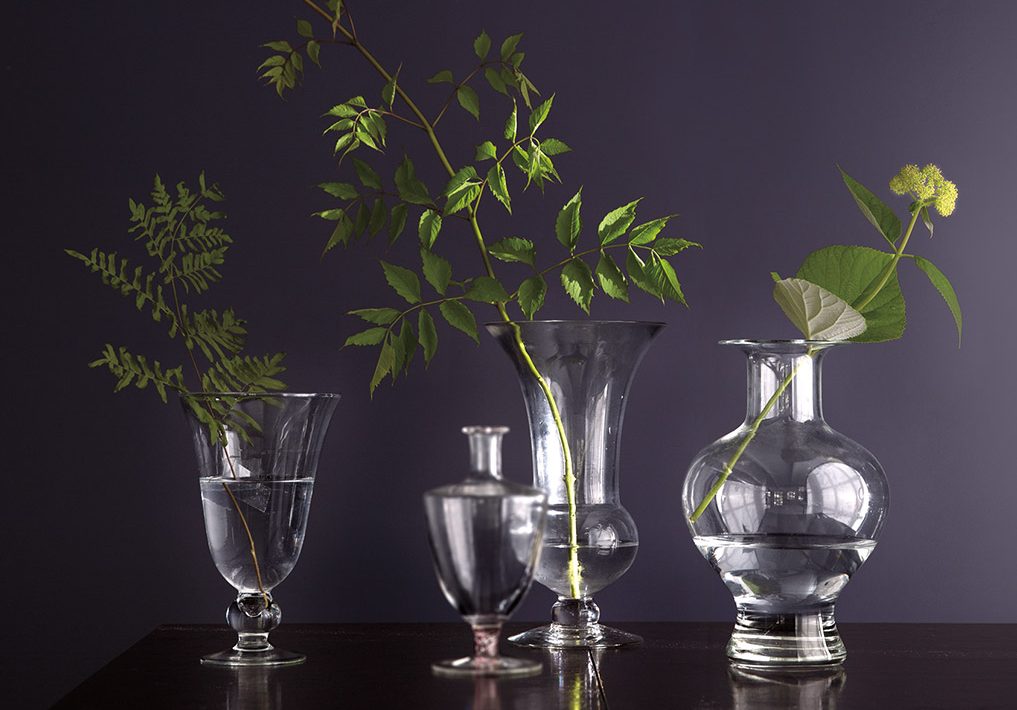
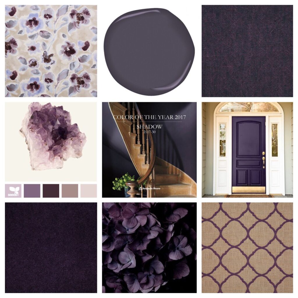
Benjamin Moore released their color of the year and there are so many ways to explore this beautiful color called
Shadow 2117-30.
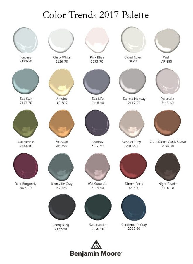
Shadow 2117-30, a rich, royal amethyst. The color leader also unveiled Color Trends 2017, a corresponding palette consisting of deep, saturated hues.
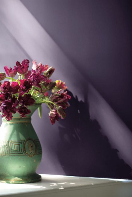
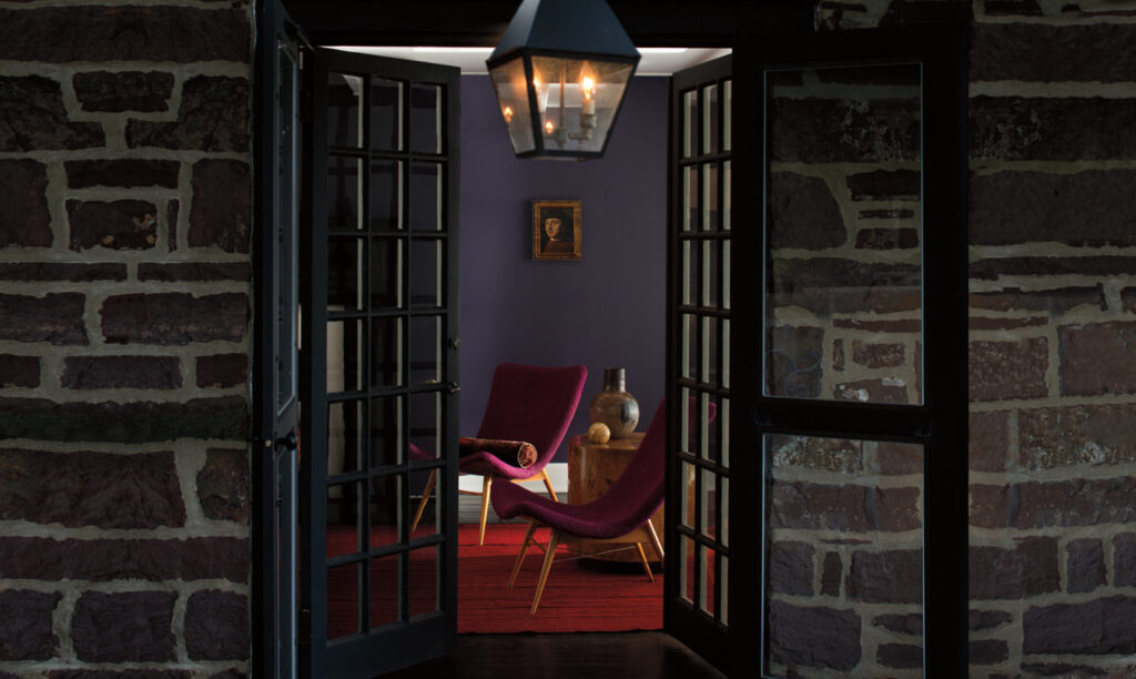
“Allusive and enigmatic, Shadow is a master of ambiance. It is a color that calls to mind a ‘past’, yet it can also make a contemporary, color-confident statement,” said Ellen O’Neill, Benjamin Moore Creative Director. “Shadow is sophisticated, provocative and poetic, it can bring energy to a space or harmony and a moment of respite.”
The Color Trends 2017 palette features 23 rich and sophisticated hues ranging from muted pales to saturated deeps. In curating the palette, the Color Studio lent significant consideration to the pairing of colors and relationships between color families, as well as a newfound level of color confidence in deeper hues among design professionals and consumers. The inspirational Color Trends 2017 color card illustrates the use of color in ways that celebrate how shadow and light travel throughout a space during the course of a day.
It is incredible how colors can make your mood change and make your house feel like home. Don’t forget to choose colors from the same family, with different light tones and you can also play with the intensity of the colors. This will make your rooms orchestrate perfectly.
If you are in need for a change, don’t hesitate to call us and we will send your way our color consultants to make this selection easier.
Palette Pro. Beautifully Done.


